Web design is more than making things look good. It’s a series of thoughtful choices that yield a beautiful and functional end result.
This is the start of the 4th year that this blog has been in existence. Every year I have done a redesign and every year I grow because of it.
This year was no exception.
In fact, this year was the most fruitful redesign I’ve ever done as far as process, performance, and design choices. For a web designer, that is a huge deal.
Much like the shoemakers children, it can be difficult for us web designers to find time for our own projects. With more than enough work serving clients, I had to make this process quick and efficient.
Some Quick Stats
I thought it would be fun to show you some of the statisticals that went into this redesign process.
- Design time (Photoshop): 2hrs
- Feedback given: 12 critical suggestions
- Design time (code): 12hrs
- Lines of code: 3,454
- Timeframe: 72hrs

Given that last year’s redesign was a six-month process, the fact that I managed to tackle this in under three days was a miracle. I felt a little bit like John Wick during this process.
People to Thank
This process wouldn’t have been nearly as fun, educational or effective without a handful of friends.
To make sure I could fully wrap my head around the Genesis framework (which is what this site is built upon) I commissioned the lead designer, Rafal Tomal. I met with him for an hour to teach me about some of the aspects that I hadn’t fully grasped. It was an incredible session and I’m super grateful for his help!
My good friend Danny Caudillo was instrumental in helping me to become a professional designer. The guy has taught me more about Photoshop than I’ll ever be able to write about. He’s also one heck of a web designer.
And whenever there is something that I can’t figure out, the first person I bug ask is Nicholas Cardot. He is the genius developer behind our Social Warfare plugin.
And lastly, I got some last-minute critical-assistance from David Kutcher who made me aware that my typography wasn’t loading properly. You’ll see just how ironic that is as you read the rest of this post. Thanks David!
A Series of Thoughtful Choices
Whenever you begin a design process you have to start with the message. What are you trying to communicate and who are you trying to communicate it to?
This is the most difficult part, and often one people either skip or don’t dive deep enough on. Thankfully I’ve been growing my audience and building my brand with this in mind for the last 4 years. I only needed to spend a little time refining the message.
I kept it simple— dustinstout.com is a place where people come to get advice, tips, resources and creative inspiration for their online efforts. So any design choices I made had to be content-focused, clutter free, and visually engaging.
By the way: The biggest reason I was able to accomplish this redesign so quickly is mostly due to the fact I’m using a Studio Press [aff link] theme as my starting point. This saves me hours of design and development time and they even look great right out of the box.
Typography
One of the most important design choices you will make for your website is the typography. I recently heard one of my design idols say,

“Web design is 90% typography.” -Chase Reeves, Fizzle.co
I agree with him. In fact hearing him say that took me on a journey to look into what other people had thought about that philosophy and I ended up finding a great blog post from iA titled Web Design is 95% Typography. Well worth the read, and still relevant even 9 years after it was written.
With that in mind I knew there were some shortcomings with last year’s redesign and my typographic choices that I wanted to rectify this year.
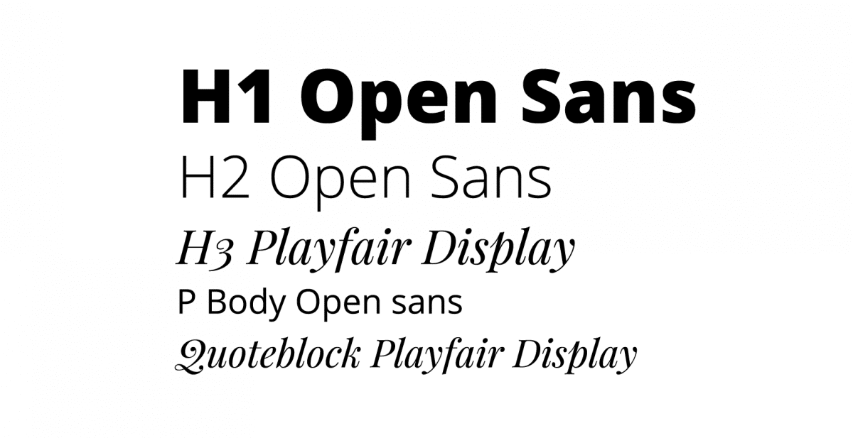
The typefaces I decided on are:
- Open Sans
- Playfair Display
Both of these typefaces are provided by Google Web Fonts completely free. I highly recommend using Google Web Fonts in your own designs.
The primary driving typeface that you will see is Open Sans. Its smooth, crisp lines make for a great general reading type. This font will be used for body, paragraph, calls-to-action, and most headline text.
To compliment the primary font I’ve chosen Playfair Display to add a bit of flare to specific text such as quotes, certain headlines, and the occasional important text. I really loved the curved lines and the motion that the type creates in contrast to Open Sans straight lines.
Staying true to my article about Creating a Stunning Reading Experience I have taken great care to make sure my paragraph text doesn’t exceed 75 characters per line and has a minimum of 1.5 line height. I still have a bit of tweaking to do on smaller screens, but it’s about 98% complete as I write this.
Action Inspires Action
One of the theories I wanted to put to the test with this redesign was this idea that action inspires action. Meaning,
When an actionable item shows interactivity, it’s more likely to be acted upon.
Or in other words— make it obvious that your calls to action are interactive. If they look static, it’s easy for a user to miss that it’s actionable.
So when I crafted the buttons, the blog post featured images (on the blog page) as well as popular post links there is a consistent subtle hover effect. When you place your mouse over certain elements that are clickable, they change subtly, showing you that they’re interactive.

While this theory isn’t backed by loads of research, I know for me (and a handful of others) this much is true; when I hover over something and it interacts with my mouse, it catches my attention and I’m much more inclined to take further action.
So I hope you enjoy my delightful little hover effects. I guess only time will tell if action inspires action the way that I see it.
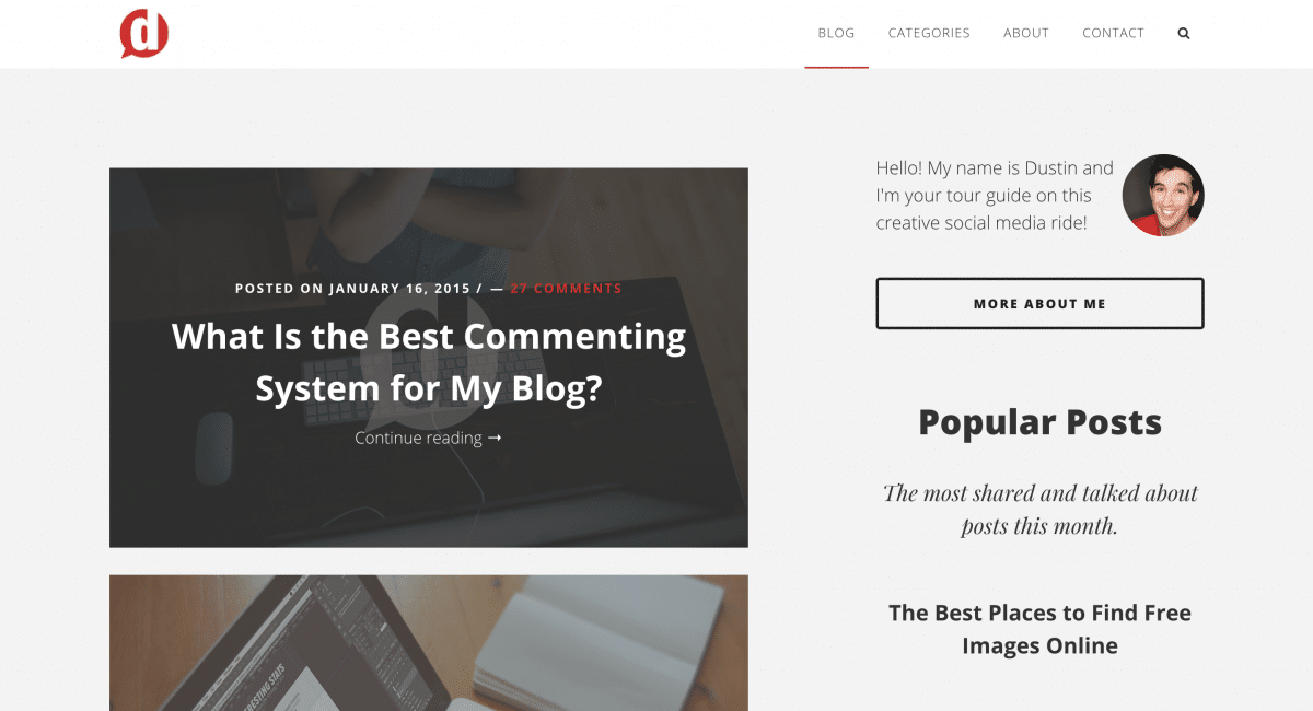
The Home Page
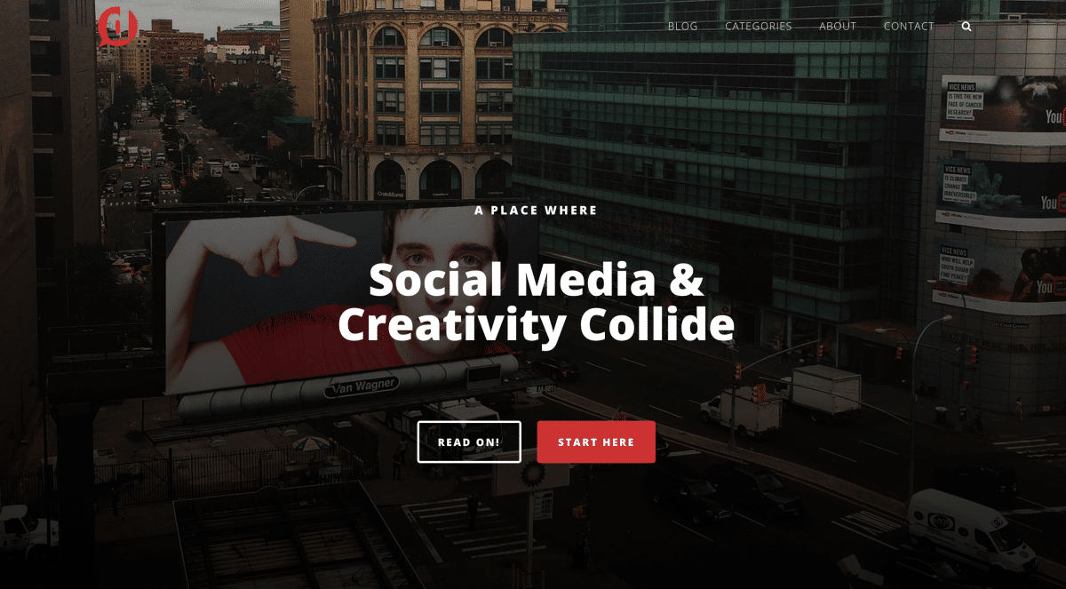
The home page has evolved drastically since I started dustinstout.com. When I began this blogging journey the home page was simply where the blog posts began. No featured content areas. No hero images. Just the blog.
Last year I decided that the home page was going to be more than just the first page of the blog. The home page was going to be the place where I gave people context about where they’ve landed.
The large majority of people visiting dustinstout.com were landing on a blog post. The odds are they’ve gotten a bit of context before clicking through either on a social link, Google search result or an email. They then get to read the blog post and get a feel for what the site is about.
For those who land on the home page as their first touch point, I felt that they needed a bit more context, a bit more of a story. But even in last year’s redesign I still included the latest blog posts as the second element on the page when a visitor scrolled.
In this new version, I’ve made the home page entirely about context and the story of what dustinstout.com is. I’ve also included a few pieces of Social Proof to help show some degree of credibility/authority.
This will be a constant work in progress as I test what works and what doesn’t.
The Blog
One of my biggest shortcomings in the last iteration of dustinstout.com was the actual blog archive. Not individual blog posts, but the chronological list of blog posts, otherwise know to web developers as the ‘loop’.
I’ve taken great care to ensure a reader’s experience is both delightful and as frictionless as possible.
Blog posts are displayed with only their featured image and title, in a chronological list. You’ll notice (on desktop) hovering over a featured image displays that interaction I was talking about above.
I decided to leave out the content, only using the featured image as a way of cutting clutter and keeping things simple.
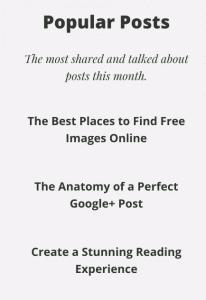
What you’ll also notice about the blog archive is the return of the sidebar!
Sidebar
Last year I abandoned the sidebar altogether. A traditional pillar of blog design was no longer an important part of my strategy.
I was inspired to do this by Medium, which also inspired me to include the full-screen featured images on every blog post. For me, it was about making sure that the primary content was distraction-free.
While most pro-bloggers gasp and cringe at such a decision, I found it to be a relief. My sentiment was confirmed as I got countless compliments from people who loved reading my blog posts because it was easy and clutter-free.
Well I decided to bring the sidebar back in, but only on the blog archives. I figured that if people are scrolling through blog posts chronologically, maybe they could benefit from some helpful items or suggestions in a sidebar.
I’ve made sure though that individual posts and pages maintain their full-width, no sidebar layout though to ensure the main content remains the focus.
Category Archives
Another sore spot in my last design was the poor state of individual category archive pages.
When you want to read through a specific category of posts you can use the navigation links at the top of the page and go to the archive list for that exact category.
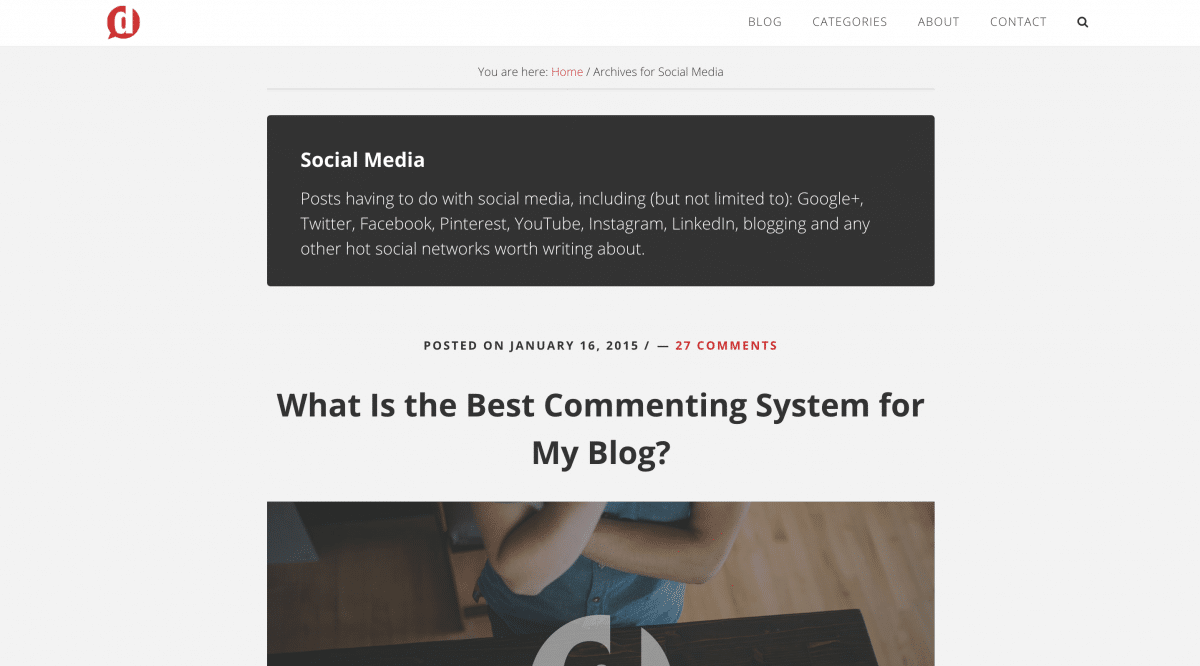
Blog posts are displayed chronologically with a description of the category at the top of the page. Additionally, I decided to keep the sidebar off of this page and give a small preview of each blog post.
I made this choice based on the fact that I feel a reader must have a very specific purpose if they have navigated to a category archive. They likely won’t need extra context or suggestions that a sidebar would likely give.
General Page Template
In this version, pages are no longer given the full-screen featured image rule. I felt is was a bit much in the last design and decided to keep pages simple with clear purpose.
Simple enough? Good.
Search, Glorious Search!
When I launched last year’s design I had great feedback from Debi Stangeland about the lack of a search function. I knew it was an issue, I just didn’t have the time to tackle it.
I’m happy to say that not only have I tackled that issue with the new design, but I was able to do it in a way that is beautiful and seamless to the user experience.
I cannot take any credit for it though because it was all thanks to a great (and timely) tutorial written by Sridhar Katakam. His post on How to Add an Animated Search Form in Genesis was exactly what I followed, with a few small styling tweaks. I was so excited when I saw that post, and am extremely happy with the result.
Refining Your Brand and Voice
Outlining this process, my thoughts and choices is as much for me as it is for you. By no means do my choices make sense for everybody, but I hope you can pick up on the intentionality of these choices.
Don’t just do things because they look good.
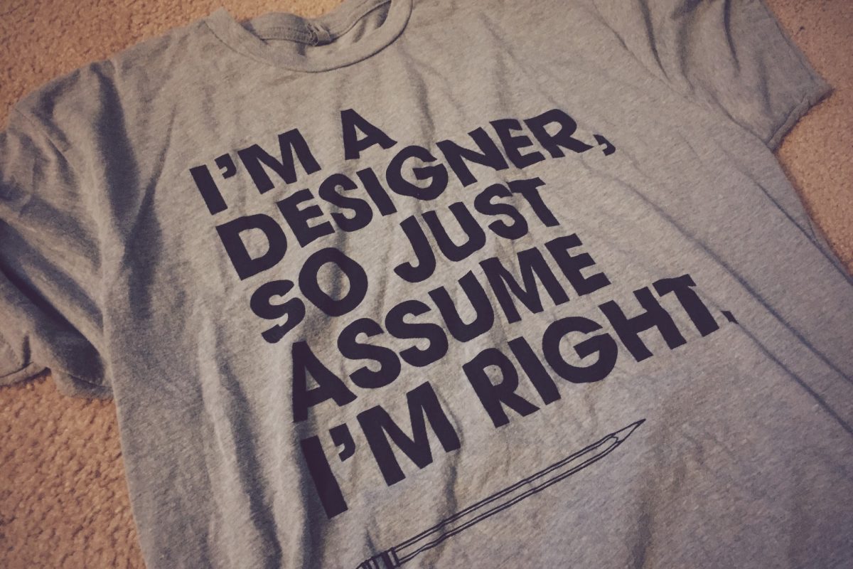
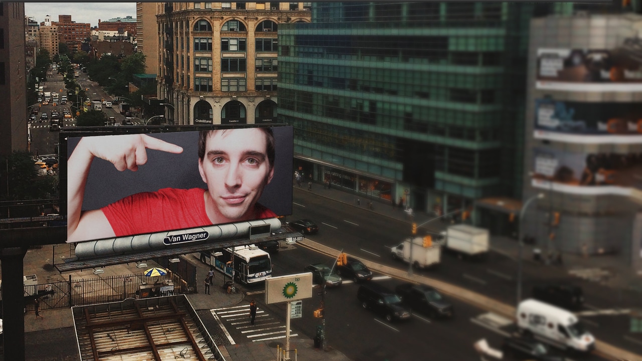
I got the shirt you see above from my friends at Impact Shirts. The owner, Don, gave it to me as a Christmas present this past year knowing I’d get a kick out of it!
Even as an opinionated, slightly OCD designer myself, I don’t assume anybody is right without a good explanation.
The choices you make in your web design and in your writing are all part of your story. How you’re telling that story is crucial in creating the brand you want people to perceive.
From choosing the right colors to ensuring that people can read your words with clarity to the visual content you produce, be thoughtful and intentional.
And don’t forget to have a little fun while you’re at it.
Leave a Reply
You must be logged in to post a comment.