Three basic design principles to help you create stunning visual content.
So you want to create awesome images that get attention and, more importantly, get shared?
You’re not a designer though? Is that right?
Well strap in, because you’re going to get a crash course in visual design without any fluff. Plain, simple, practical design principles to get you creating fast.
I recently was the guest for #BufferChat where I was asked what the most important “design rules” to follow were. My answer was balance, framing, and contrast.
If you understand these three fundamental concepts you can create stunning visual content that people will love.
Balance is Beauty

Our brains are programmed to see symmetry as beauty. But when it comes to visual design both traditional symmetry and asymmetry can both be beautiful as long as a balance exists.
Let’s apply this concept to creating social visual content.
When creating a piece of visual content you usually have a combination of the following elements:
- background image/photo
- text/title/tagline
- logo/watermark/branding
Assuming your background image/photo was obtained from a high-quality source (like the ones mentioned in my Best Places to Find Free Images), the photographer has probably already taken the time to balance out the shot. All you need to do is position your text and/or branding in a way that doesn’t unbalance the visual aesthetic.
Start by imagining (or use a visual creation tool to impose) guidelines marking out where the center of the image is.
Then you’ll be able to see where the subject or focal point of the image is and add your text in such a way as to balance it out.
Example:
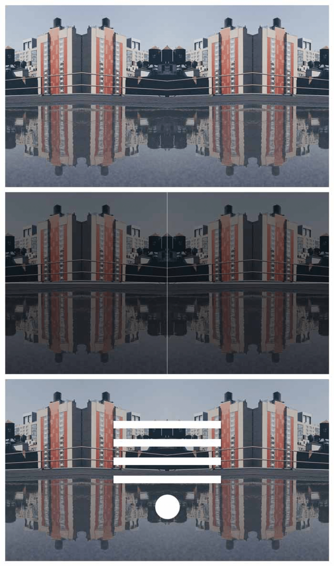
Okay, that one is pretty easy because the image is already perfectly symmetrical. So all you need to do is put your text in the center and call it a day.
But what happens if your background image isn’t perfectly symmetrical?
I’m glad you asked!
Asymmetry can be just as beautiful as symmetry as long as you balance it all out. Think of it like a set of scales. If the subject or focal point in the background photo are on the left side, then when you add your text you’ll want to put it on the right side.
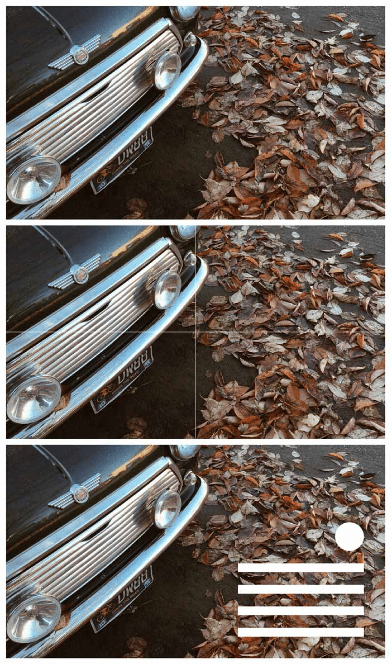
In the example above, you see that the car is the subject of this background photo. The subject covers the top-left portion of the image so to balance it out with our elements we put them in the bottom right.
Here’s a few more examples to help you get the hang of it:




It doesn’t always have to be an exact science, but just remember to try and maintain the illusion of visual balance.
If the image isn’t balanced it can give the impression of instability making the on-looker feel like something is wrong. If you’re trying to evoke a feeling of instability or something similar, then go ahead and throw balance out the window.
But if you want your image to communicate beautifully, create visual balance between the photo/background and the text/logo elements.
[clickToTweet tweet=”#VisualContent #ProTip: Create visual balance between background & text elements.” quote=”#VisualContent #ProTip: Create visual balance between background & text elements.”]
Make sense? Good, let’s move on.
Framing the Photo
What I call framing is essentially creating an invisible frame around the outer most part of your image in which no elements are touching. Think of this as your non-negotiable white-space.

In the image above I’ve made my framing area red so you can see how I’ve applied it to the templates you’ve already seen.
Framing is especially important when you’re placing elements close to the edge of an image. If everything is in the middle you usually don’t need to worry.
In order to process imagery, our brain immediately looks for structure— something we can grasp on to. If our brains can instantaneously identify the structure we can interpret what we’re seeing quicker and with more ease.
This also ties back into balance.
Consistent spacing of elements (or in other words, framing) displays a set structure.
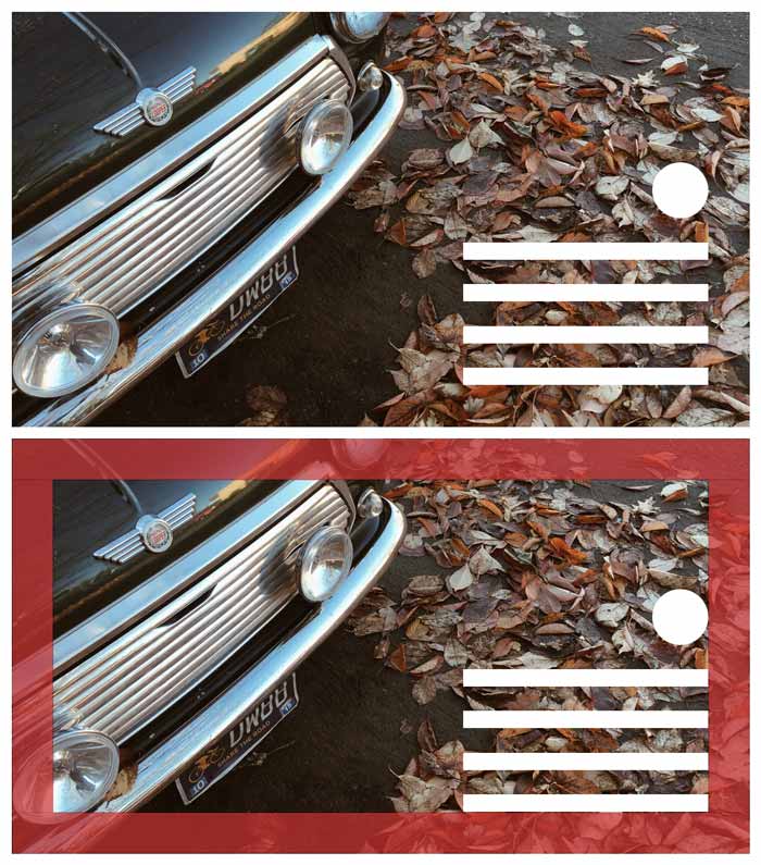
Notice how when you first see the image without the frame, your brain has already identified where the frame is.
When you place text or watermarks too close to the edge (or right against the edge) of an image it feels constricting. For people who are claustrophobic (or overly OCD designers like myself), it can cause tension.
When the framing is inconsistent it can also throw off the balance which takes us back to square one.
[clickToTweet tweet=”#VisualContent #ProTip: Frame your images & text, giving clear, consistent spacing for all text elements.” quote=”#VisualContent #ProTip: Frame your images and text, giving clear-cut and consistent spacing for all text elements.”]
If you’ve already downloaded my social media image templates then you’ll notice I’ve included the guidelines for the framing area for you. You’re welcome. 😉
Contrast is Key
Contrast is probably the hardest concept to explain. So let me start with a visual:

Contrast is most easily explained as the difference between two or more things. When it comes to visuals, we’re talking about the visual distinction between the background and the subject matter. The closer the two elements are to blending in, the lower the contrast. The lower the contrast, the harder they are to distinguish.
In the context of visual content and social media images your goal is to communicate a message. If that message is difficult to read, you’re shooting yourself in the foot.
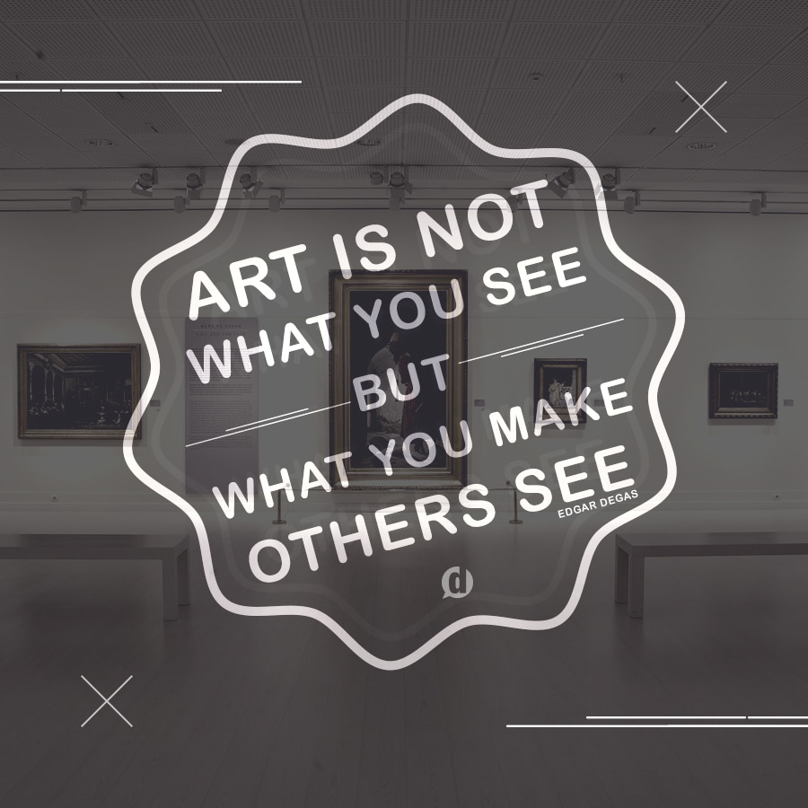
When working with photo backgrounds though, it can sometimes be easy to accidentally position your text in a way that makes it difficult to read.

Before finalizing your images always be sure that they’re fully readable. You may need to play with the text color a bit or even move the text around to ensure it doesn’t disappear into the background.

[clickToTweet tweet=”#VisualContent #ProTip: Make sure your message has enough contrast to be clearly understood without eye strain.” quote=”#VisualContent #ProTip: Make sure your message has enough contrast to be clearly understood without eye strain.”]
Bonus tip: One of the easiest ways to create good contrast is to add a semi-transparent layer of black (or any dark color) between the background image and text.
Conclusion
If you manage to create an image with balance, framing and good contrast then your message will not only be effective, but beautiful as well.
As always, practice makes perfect so give it a go. Have some fun. Use one of my recommended mobile apps for visual content or one of the desktop apps that I’ve recommended as well.
In the comments below, share some visual content pieces you’ve created! You can leave a comment by clicking here.

Leave a Reply
You must be logged in to post a comment.