Category: Design
Tips, tutorials, and resources about design including web design, branding, graphic design, typography, image sharing and any other crafted visual media.
-

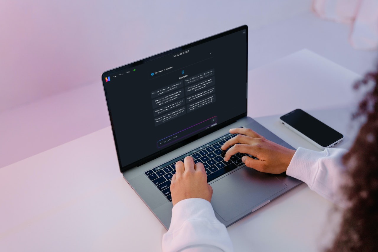
Boost Creativity with ChatGPT for Content Marketing
Ready to take your content marketing game up a notch (or ten… or eleven)? Let’s dive into the futuristic world of ChatGPT, a cutting-edge AI language model that will have…
-

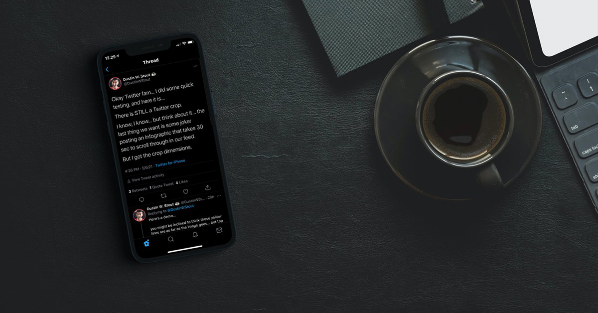
Twitter Image Sizes & Dimensions 2024
Now that the “Twitter crop” is gone (or is it?) people are wondering: what are the perfect Twitter image sizes in ? Knowing this answer will help you stand out…
-
Your Content Calendar Strategy for 2021: Brilliantly Simple to Use
Wouldn’t it be nice to have your entire content calendar done for the next 365 days? Wouldn’t you love to have a well-thought-out plan for your 2021 content marketing? Instead…
-
Copyright Free Images: 20+ Resources You Need to Know
Looking to find copyright free images to use in your blogs, websites or social media posts? The following sites are the best on the internet. Do you frequently share images…
-
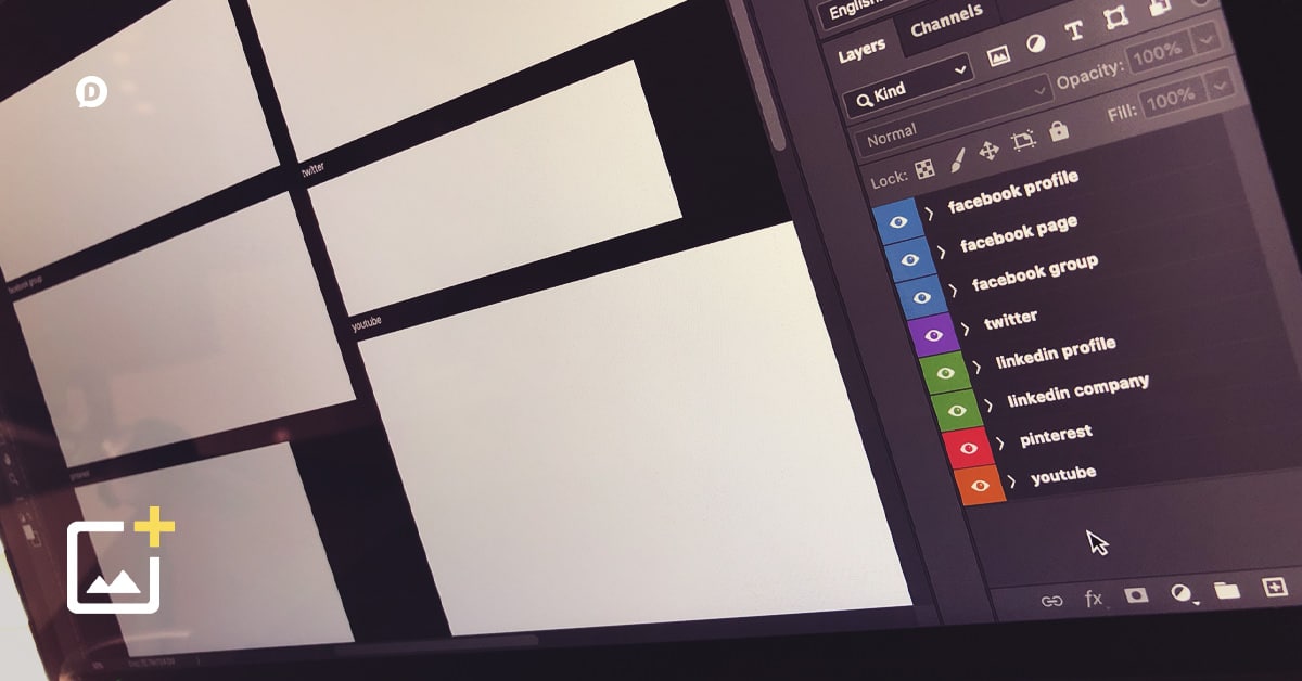
Social Media Cover Photo Templates for the Most Popular Social Networks
Your one-stop resource for always-updated cover photo sizes (and templates) for Facebook profiles, Facebook Pages, Facebook Groups, Twitter, LinkedIn, Pinterest and YouTube. Social media is becoming more and more visual…
-
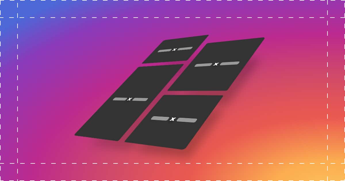
Instagram Image Sizes and Dimensions 2024: Everything You Need to Know
What are all the Instagram photo sizes and dimensions you need to know for ? How about Instagram video resolution and size ratios? Sit back and relax, because this post…
-
Custom Short URLs for Social Media: What, Why, and How
Back when your social media posts had strict character count limitations, sharing links to web pages was a bit stressful—especially on Twitter. That’s when short URLs became a necessity. Without…
-
Social Media Statistics 2024: Top Networks By the Numbers
Looking for the latest social media statistics? Want to know which social media networks and apps are the most popular in ? Whether you’re building a presentation, a pitch, or…
-

Social Media Icons: Free and Always Updated
The most meticulously updated and accurately crafted minimal social media icons on the internet. Now includes the newest Facebook icon! The most recent update to the icon set includes six…
-
2024 Social Media Logos: 21 Most Popular Social Networks [Free Download]
An always-updated, one-stop free resource for the most current social media logos of the most popular social networks. And the best part is these minimalistic social icons are all free.…


![2024 Social Media Logos: 21 Most Popular Social Networks [Free Download]](https://dustinstout.com/wp-content/uploads/2016/04/social-media-logos-feature-1920x1080-1.jpg)